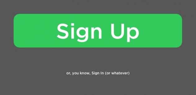
Are sites slighting members by giving “Sign Up” buttons more prominence than “Sign In” buttons?
The world is full of poorly designed experiences. Let’s identify them, share them, and shrink their numbers. Here Daniel Brown muses on the perceived slighting of members in favor of those who haven’t yet signed up for certain services:
This isn’t so much an example as a trend I don’t understand.
Many sites now emphasize “Sign Up” over “Sign In”—and not in a subtle way. The “Sign Up” buttons are generally huge, obvious, and welcomingly green.
Meanwhile, the “Sign In” function is often just a text link dwarfed by the larger “Sign Up” button or tucked away in a corner waiting to be found.
I was invited to take part in a panel discussion at this year's Absa XDC…
Part of a panel discussion titled 'Can Brand Trust Scale Across Ecosystems?' at the annual…
Spoke at the second Absa Experience Design Collab Conference on Designing Propositions. Explored how design…
January 2025 has brought a wave of exciting advancements and strategic shifts in the financial…
Spoke at the inaugural Absa Experience Design Conference on Designing the Future through Prototyping. The…
Presented an overview of UX and Design Research concepts and tools to students at the…